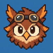
Owlboy Pixel Art: How Its Color, Animation, and Detail Create a Living World
Explore how Owlboy pixel art uses color, animation, silhouettes, and layered environments—and learn techniques for your own pixel scenes.
Few games make low-resolution artwork feel as expressive and alive as Owlboy. Owlboy pixel art matters because it demonstrates that visual depth does not depend on photorealism—it comes from deliberate color, movement, composition, and character acting. By studying Owlboy pixel art, artists and players can better understand how carefully placed pixels create atmosphere, personality, and emotional impact.
Developed by D-Pad Studio, Owlboy became known for an unusually long production journey spanning roughly a decade. That extended development helps explain why its world feels so polished: backgrounds are densely layered, animations communicate character, and nearly every location has a distinct visual identity.
This analysis breaks down the techniques behind the game's appearance and turns them into practical lessons for artists, designers, and fans.
What Makes Owlboy Pixel Art So Distinctive?
The most recognizable quality of Owlboy pixel art is its balance between intricate detail and immediate readability. The game presents elaborate temples, cloud-filled skies, mechanical structures, forests, and floating settlements without allowing the scenery to overwhelm its characters.
That balance is difficult to achieve. Pixel artists have a limited grid, and every cluster can affect the clarity of an object. Owlboy manages the problem by organizing visual information into layers.
| Visual Layer | Primary Purpose | Typical Treatment |
|---|---|---|
| Foreground | Frames the playable space | Darker values and stronger contrast |
| Character layer | Keeps actors readable | Clear silhouettes and distinct colors |
| Interactive terrain | Communicates movement boundaries | Defined edges and repeatable textures |
| Midground | Establishes location and scale | Moderate detail with softer contrast |
| Background | Creates depth and atmosphere | Reduced contrast and cooler colors |
| Effects layer | Adds motion and feedback | Clouds, particles, light, smoke, or debris |
This hierarchy directs the eye toward what matters. Otus, the silent owl protagonist, remains identifiable even when surrounded by complicated architecture or animated effects. His rounded shape, large head, short body, and prominent cloak form a silhouette that is difficult to confuse with another character.
The art also avoids treating every surface equally. Important objects receive crisp outlines or contrasting highlights, while distant elements use quieter shapes. This produces a visual rhythm: detailed areas reward observation, but restrained areas give the eye room to rest.
Detail Serves the Story
Decorative pixels are rarely valuable on their own. Their real purpose is to suggest history, climate, technology, culture, or mood. A worn structure can imply age. Repeated mechanical shapes can make an area feel industrial. Moving foliage or drifting clouds can indicate altitude and weather without explanatory dialogue.
That is an essential lesson from the game's visual design: detail becomes meaningful when it supports the world rather than merely filling empty space.
Color and Lighting Build the Atmosphere
Color is one of the strongest tools in Owlboy pixel art. Locations use distinct palette families, helping players recognize a change in environment before reading any text.
Warm colors often make settlements and interiors feel inviting, while cool blues and muted purples create distance or melancholy. Dangerous areas can introduce harsher contrasts, acidic accents, or darker shadows. These changes affect emotion while preserving the overall artistic identity.
| Palette Decision | Visual Effect | Practical Use |
|---|---|---|
| Warm highlights against cool shadows | Creates dramatic volume | Characters, buildings, and interiors |
| Lower saturation in distant scenery | Suggests atmospheric depth | Mountains, clouds, and remote structures |
| Bright accent colors | Pulls attention immediately | Collectibles, attacks, switches, or hazards |
| Closely related hues | Produces visual harmony | Large environmental surfaces |
| Dark value framing | Focuses attention inward | Caves, rooms, and dramatic encounters |
The game frequently creates depth through value separation rather than relying only on outlines. A light character against a darker wall remains readable; a dark foreground element against a bright sky appears closer. This approach is especially effective in pixel art because excessive outlines can make a scene feel crowded.
Lighting also gives flat sprites a sense of volume. Small highlight clusters define rounded cheeks, metal edges, feathers, stone, and cloth. Artists do not need dozens of shades to achieve this effect. In many cases, three or four well-chosen values—shadow, base color, light, and a selective highlight—can communicate a convincing material.
For artists studying the style, converting a screenshot to grayscale is a useful exercise. If the character, terrain, hazards, and background remain distinguishable without color, the value structure is doing its job.
Animation Gives Every Character a Personality
Static screenshots show the craftsmanship of Owlboy pixel art, but animation reveals its personality. Characters shift their weight, react to conversations, exaggerate expressions, and move with distinct rhythms. Otus does not feel alive simply because he has many frames; he feels alive because those frames communicate intention.
Pixel animation works best when poses are designed around readable extremes. An anticipation frame prepares the viewer for an action, the main pose delivers it, and follow-through prevents the movement from stopping unnaturally.
| Animation Phase | Function | Example Application |
|---|---|---|
| Anticipation | Signals what will happen next | Crouching before a jump or attack |
| Primary action | Delivers the key movement | Launching, striking, firing, or turning |
| Overshoot | Adds energy and weight | A cloak or limb moving beyond its resting point |
| Recovery | Returns the character to control | Settling after landing or recoil |
| Secondary motion | Supports the main action | Feathers, clothing, hair, smoke, or equipment |
| Idle variation | Prevents mechanical stillness | Blinking, breathing, glancing, or fidgeting |
The protagonist's flying motion is particularly important because flight defines navigation. His pose needs to show direction, effort, and responsiveness without becoming visually noisy. Companions carried during flight must also remain understandable, creating an added animation challenge: two characters effectively become one moving gameplay unit.
Community reports and player experience often emphasize the expressiveness of the cast. That response makes sense because movement performs some of the narrative work normally handled by speech. Otus is silent, so posture and facial expression must communicate embarrassment, fear, determination, and relief.
Artists can apply the same principle without producing enormous sprite sheets. A strong six-frame animation often communicates more than a weak 20-frame sequence. Prioritize key poses first, then add transitional frames only where they improve timing or clarity.
Practical Lessons for Creating Similar Pixel Art
Reproducing the exact appearance of a commercial game is neither necessary nor creatively useful. A better goal is to understand the design decisions behind Owlboy pixel art and adapt those principles into an original style.
Start with silhouettes rather than details. At a small viewing size, a character should still be identifiable by overall shape. If two characters share similar proportions, distinguish them with posture, clothing shapes, head forms, or equipment.
Next, build a limited palette. Too many near-identical shades make sprites difficult to edit and can weaken visual unity. A compact palette forces each color to have a purpose.
| Step | Action | Quick Test |
|---|---|---|
| 1. Define the silhouette | Draw the subject in one solid color | Can you identify it at 100% scale? |
| 2. Choose base values | Add shadow, midtone, and light | Is the form clear in grayscale? |
| 3. Limit the palette | Remove redundant shades | Does each remaining color add information? |
| 4. Group pixels | Replace isolated noise with clusters | Do surfaces look intentional rather than speckled? |
| 5. Separate visual layers | Adjust contrast by depth | Is gameplay readable over the background? |
| 6. Animate key poses | Establish extremes before in-betweens | Does the action work with only keyframes? |
| 7. Test in motion | View the asset inside a scene | Does it remain readable during gameplay? |
Pixel clusters deserve special attention. A cluster is a connected group of pixels that defines a curve, plane, texture, or shadow. Clean clusters usually look more deliberate than scattered single pixels. Isolated pixels can be useful for sparks or stars, but excessive noise weakens shapes.
For a scene inspired by the game's visual principles, try this compact workflow:
- Create the composition at a low working resolution.
- Use large blocks to establish sky, terrain, and architecture.
- Reserve the strongest contrast for the playable area.
- Shift distant layers toward cooler or less saturated colors.
- Add one environmental motion, such as drifting clouds.
- Introduce small highlights only after the major forms work.
- Review the scene at its intended display scale.
Avoid drawing every leaf, brick, or feather individually. Suggest repeated texture with a few representative clusters, then leave quieter spaces between them. Selective detail makes important areas appear richer because the entire image is not competing for attention.
The same restraint applies to animation. Use movement where it supports gameplay, atmosphere, or characterization. A flag moving in the wind can establish weather; particles can show impact; a brief facial change can deliver an emotional beat. Constant motion everywhere may distract from the player.
Why the Art Remains Influential
The lasting appeal of Owlboy pixel art comes from cohesion. Its environments, portraits, sprites, effects, and interface feel as though they belong to the same world. The game does not use pixel art merely as a nostalgic filter. It treats the medium as a complete visual language.
The lengthy production history also provides context for its finish. Creator Simon S. Andersen has publicly reflected on the difficult, decade-long journey involved in bringing the game to completion. That history makes the artwork especially instructive: visual polish can require extensive revision, but long production alone does not guarantee quality. Clear artistic priorities remain essential.
Players interested in seeing the animation and environments in their intended context can visit the official Owlboy page on Steam. Viewing full scenes in motion is more educational than examining isolated screenshots because it reveals timing, camera movement, layer separation, and gameplay feedback.
The game's art offers several enduring lessons:
- Technical limits can encourage stronger design decisions.
- Readability should guide detail, contrast, and animation.
- Character acting can communicate story without dialogue.
- Environmental palettes can establish mood and location.
- Cohesion matters more than maximizing the number of colors or frames.
- Revision is a normal part of polished visual development.
For aspiring artists, the best tribute is not a direct imitation. It is applying these principles to new characters, settings, and stories.
Frequently Asked Questions
Who created the Owlboy pixel art?
Simon S. Andersen, a co-founder of D-Pad Studio, is closely associated with the game's art and visual direction. The completed game reflects the broader studio's work across design, animation, programming, audio, and production.
Why does Owlboy's artwork look more detailed than typical pixel art?
The artwork combines carefully grouped pixels, layered backgrounds, strong value separation, selective highlights, and expressive animation. Its perceived detail comes from organization as much as pixel count. Quiet areas make intricate focal points appear even richer.
How long did Owlboy take to develop?
The project is widely associated with a development period of approximately ten years before its 2016 release. Its creator has described that journey as challenging, offering useful context for the volume of refinement visible in the final game.
How can beginners study Owlboy pixel art effectively?
Begin with one small study focused on a single principle, such as silhouettes, palette control, or atmospheric depth. Recreate the underlying technique without tracing or publishing copied assets. Then design an original scene using the same constraint, compare the results, and revise the areas where readability breaks down.
Related Guides
Owlboy Art Book Guide: What Fans Should Know Before Buying
Explore Owlboy art book options, official sources, collector checks, and ways to enjoy the game's detailed pixel art.
Owlboy Soundtrack Guide: Why Jonathan Geer’s Soaring Score Still Resonates
Explore the Owlboy soundtrack, its orchestral style, standout themes, musicians, formats, and lasting appeal among players.
Owlboy Sprites: A Practical Guide to Pixel Art, Animation, and Asset Study
Explore Owlboy sprites, animation techniques, sprite resources, and practical ways to study the game's detailed pixel art.
Owlboy Trailer Guide: What the Nintendo Switch Preview Reveals
Explore the Owlboy trailer, its Switch release details, gameplay highlights, visual style, and what to watch for before playing.